The Warmth of Coffee Paint Colors: From Beans to Walls


Coffee, a beverage that has captivated the hearts of millions, has transcended beyond the cup into the realm of color and design. The rich, inviting tones of coffee have found their way onto our walls, bringing a sense of warmth and comfort to our spaces.
In this exploration of coffee paint colors, we delve into the hues that make our homes feel more like a welcoming café.
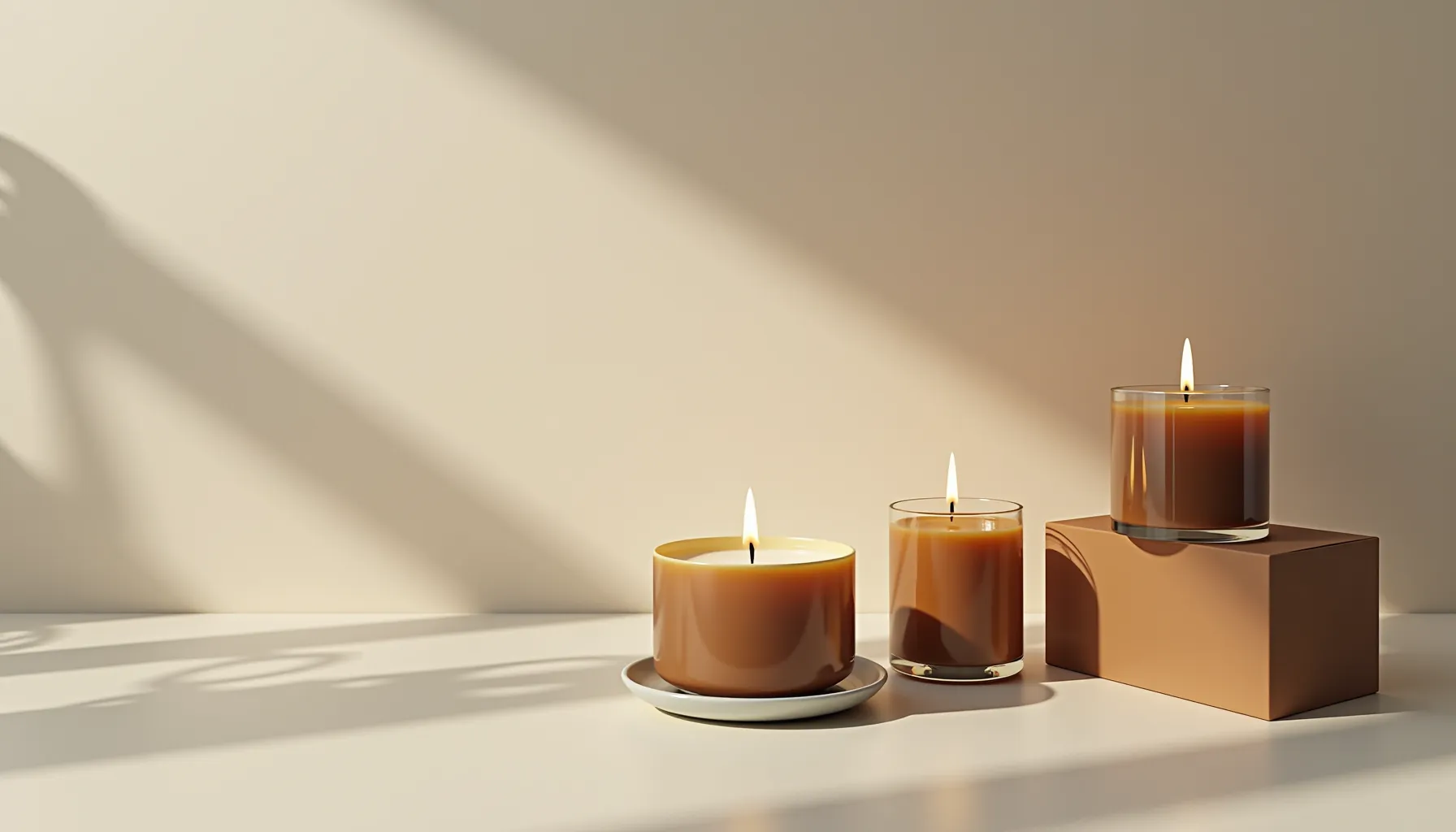
Coffee paint colors are not just about a single shade but a palette that ranges from the light, creamy latte to the deep, robust espresso. These hues are versatile, sophisticated, and can create a statement in any room. Let's start by looking at some high-authority sources that offer insights into the world of coffee colors.
One such source is Benjamin Moore, a titan in the paint industry, known for its vast array of colors and finishes. Their take on coffee colors, particularly the popular 'Swiss Coffee,' is a testament to the timeless appeal of these warm tones.
The lighter end of the coffee color spectrum is where you find the soft, milky shades of latte and cappuccino. These colors are perfect for creating a serene and calming environment. They reflect light beautifully, making them ideal for smaller spaces or rooms with limited natural light.
As we move to the medium roast, we encounter the true coffee color. This is the balanced hue that holds a bit of the darkness of the coffee bean, yet retains a touch of the milk's creaminess. It's a versatile color that works well in living rooms and dining areas, where it brings a sense of warmth and sociability.
At the darker end, we have the rich and intense espresso and French roast shades. These colors are bold and sophisticated, making a statement in any space. They are excellent for accent walls or for creating a dramatic and cozy atmosphere.
Photo by Luiza Carvalho on Unsplash
When incorporating coffee colors into your interior design, consider the mood you want to create. Lighter coffee tones can make a room feel more spacious and airy, while darker tones can add drama and intimacy.
For a cohesive look, pair coffee colors with complementary tones like soft blues, muted greens, or even dusty pinks. These combinations can evoke a sense of balance and harmony in your space.
Colors have a profound impact on our emotions, and coffee paint colors are no exception. They can make us feel grounded, comforted, and at ease, much like the beverage itself. Utilizing these colors in your home can create a welcoming atmosphere that resonates with comfort and familiarity.
Mixing different coffee hues can add depth and complexity to your décor. Consider using a light coffee color for the walls with darker trims or furniture pieces. This layering of tones can add visual interest and a professional touch to your design.
Staying ahead of trends is crucial in design, and coffee colors are seeing a resurgence in popularity. They are being used not just on walls but in cabinetry, textiles, and accessories. The trend is towards creating a holistic environment where the warmth of coffee colors provides a nurturing backdrop to everyday life.
Now, let's take a moment to appreciate the artistry of coffee colors through a visual medium. We've found a YouTube video that beautifully demonstrates the versatility and beauty of coffee paint colors in interior design.
Embedding a video into an article not only breaks up the text but also provides a dynamic learning experience for visual learners. The video we've selected showcases the application of coffee paint colors in various settings, offering inspiration and practical tips for your own space.
As we continue our journey through the world of coffee paint colors, let's consider some statistics and analysis that add credibility to our discussion. According to a study by Sherwin-Williams, paint colors in the brown spectrum, which includes coffee hues, have been shown to increase feelings of stability and resilience in a home. This insight underscores the psychological benefits of choosing coffee colors for interior spaces.
Continuing our exploration of coffee paint colors, we delve into the practical applications of these rich hues in our homes. Each room offers a new opportunity to infuse character and warmth through the strategic use of color. Let's explore how coffee tones can enhance our living spaces, from the kitchen to the bedroom, and even the bathroom.
The kitchen, often referred to as the heart of the home, is a perfect canvas for coffee colors. The warm tones of coffee can complement wooden cabinets and natural stone countertops, creating an inviting space for family gatherings and culinary adventures.
In the living room, coffee paint colors can create a backdrop for relaxation and socializing. The right shade can make the space feel more grounded and cozy, perfect for unwinding after a long day or hosting friends and family.
The bedroom is a personal sanctuary, and the soothing nature of coffee colors can contribute to a restful environment. Lighter coffee tones can help the room feel airy and peaceful, while darker tones can lend an air of sophistication and luxury.
Even the bathroom can benefit from the warmth of coffee colors. These tones can turn a purely functional space into a spa-like retreat, offering a sense of tranquility and escape.
In a home office, the right color can influence productivity and focus. Coffee colors, with their natural and grounding properties, can help create a focused yet calming work environment.
As we wrap up our comprehensive look at coffee paint colors, it's clear that these hues offer more than just aesthetic appeal. They have the power to transform spaces, influence mood, and create environments that resonate with comfort and style. Whether you're looking to refresh a single room or redesign your entire home, coffee colors offer a palette that's both timeless and on-trend.
In conclusion, coffee paint colors are a versatile and stylish choice for any interior design scheme. They can bring warmth to a room, create a sense of comfort, and even influence our emotions and behaviors. From the creamy lightness of a latte to the deep richness of espresso, these hues can be adapted to suit any style and purpose. As we've seen, coffee colors can be the perfect complement to a variety of spaces, enhancing the overall aesthetic and creating an inviting atmosphere.
When choosing coffee paint colors, it's important to consider the natural lighting of the room, the size of the space, and the existing decor. By doing so, you can select a shade that not only looks beautiful but also enhances the functionality and feel of the room. Whether you're aiming for a bold statement wall or a subtle backdrop for your daily life, coffee colors can be tailored to achieve your desired effect.
As trends come and go, the timeless appeal of coffee hues remains constant. They are a testament to the enduring power of nature-inspired colors in our homes. So, the next time you're contemplating a new paint color, consider the warm embrace of coffee tones – they just might be the perfect ingredient to revitalize your space and bring a touch of the coffeehouse charm into your daily living.
What are the best lighting conditions for coffee paint colors?
Can coffee colors work in small spaces?
Are coffee paint colors suitable for any style of decor?
How do I choose the right coffee paint color for my room?
Can I mix different coffee paint colors in one room?
This concludes the second part of our article on coffee paint colors. Stay tuned for more insights and inspiration on using color to create beautiful, functional spaces in your home.